Chiba Sushi Rebranding
Role: Graphic Designer
Deliverables: Logo Redesign | Visual Design
Client: Chiba Sushi
Programs Used: Photoshop | Illustrator
Project Description
Chiba Sushi is a cozy Japanese restaurant in San Diego that holds a special place in my heart. I’ve been visiting since childhood, cherishing memories of family dinners and delicious meals. Over the years, I’ve come to admire not just the food but the restaurant’s ambiance and character. As I’ve grown and developed my design skills, I wanted to explore a rebranding for Chiba Sushi for fun.
The Challenge
The challenge I ran into with this project, is that Chiba's existing identity reflects a bygone era and feels somewhat outdated. While it might have been in vogue 19 years ago, in today's dynamic standards, it shows signs of aging and could benefit from a contemporary touch-up.
The Solution
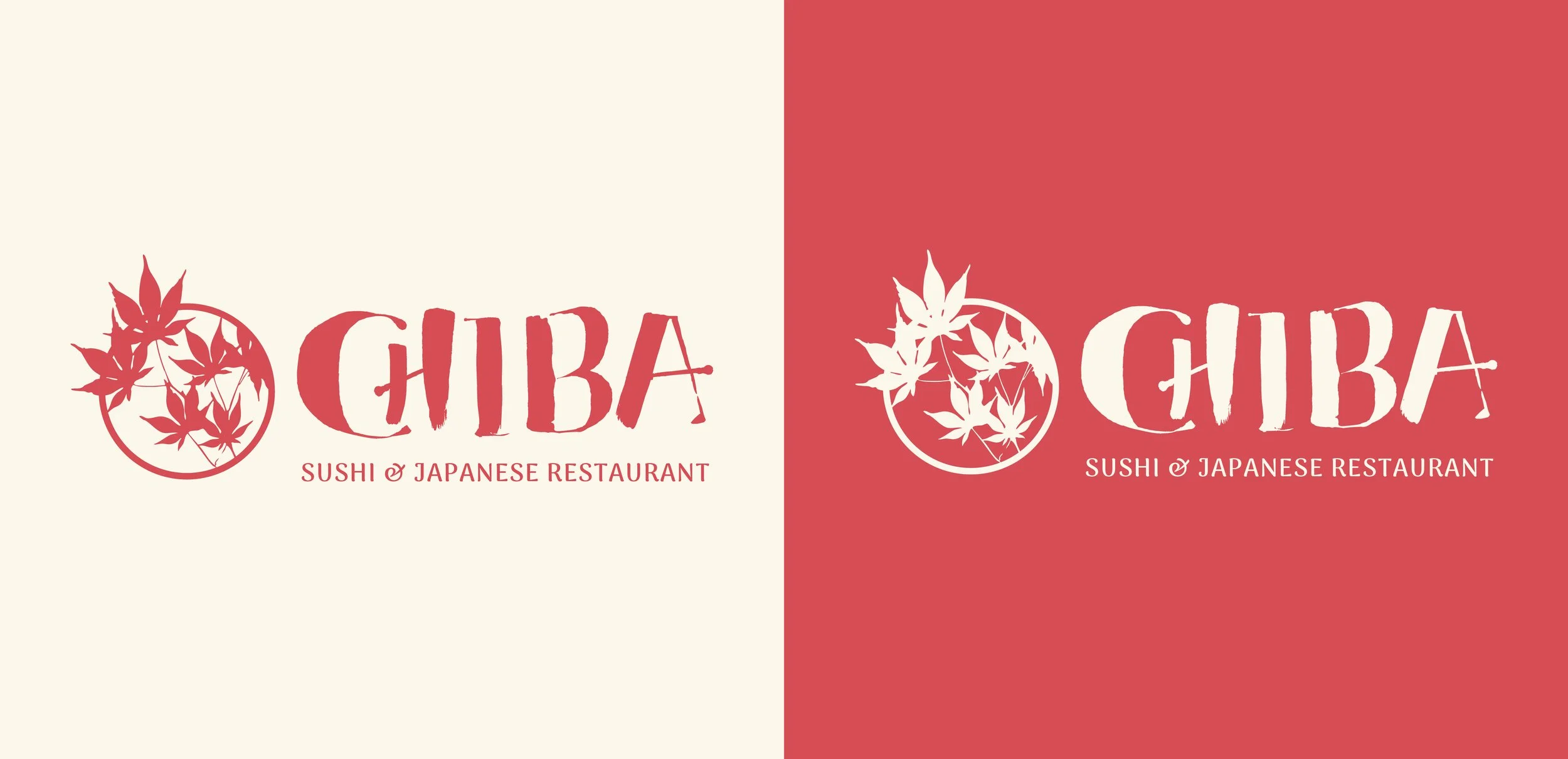
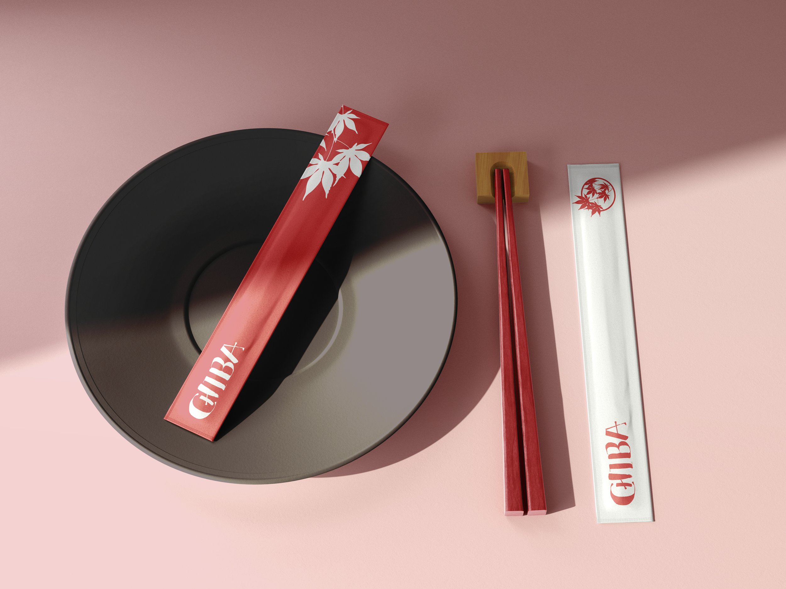
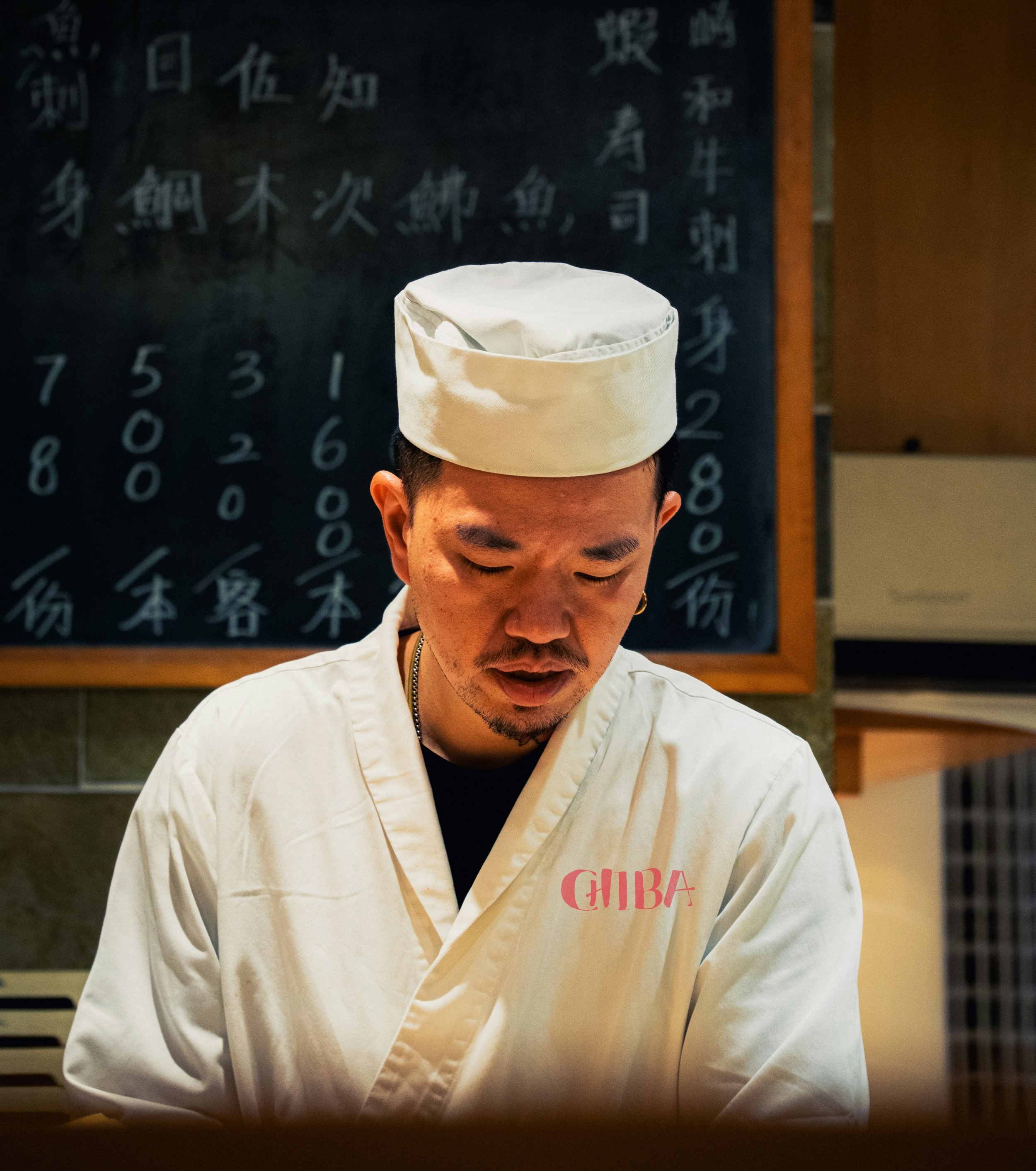
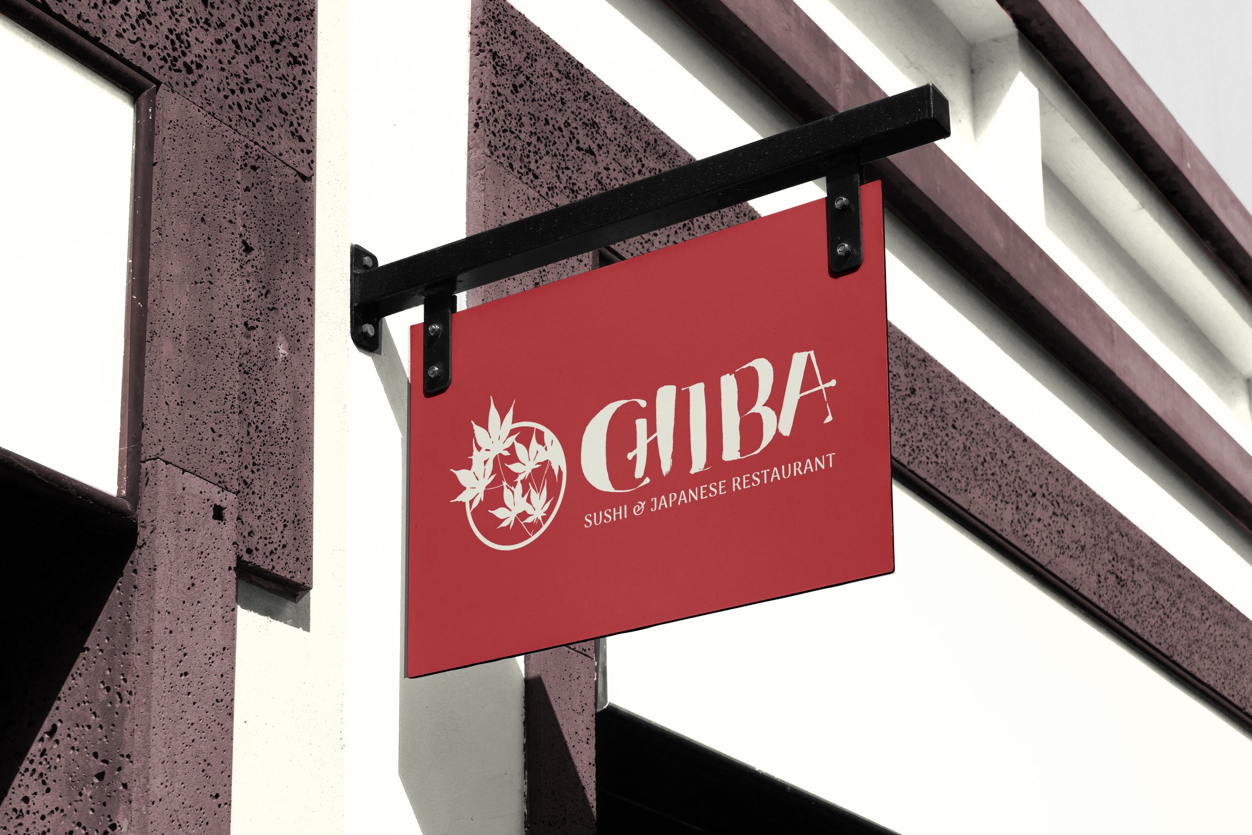
Since this project was for fun, I imagined Chiba Sushi in a modern setting. I redesigned the logo icon to better reflect the restaurant’s name and chose a typeface that is modern while incorporating Japanese elements, with a subtle watercolor texture for added character.

The Process
When it comes to the process of logo design. I sketched out a few options using different pen strokes and playing with different styles before moving forward with a design I thought worked. I also researched what the word “Chiba” means, the word is split in two, “Chi” means “Thousand” and “Ba” is “Leaf”.
Primary Logo

Secondary Logo

Icon